In the fourth round of intervention, the part I most looked forward to was seeing how industry designers would interpret the five sketches created during the co-creation workshop. I had originally expected their feedback to vary widely from one individual to another, but as I began reading the questionnaires, I realized that the responses were far more consistent—and even clearer—than I had anticipated.
Contrary to my earlier concern about potential “misinterpretation,” the designers almost all accurately captured the cultural cues embedded in the sketches. The words that appeared most frequently in their responses were teahouse, gaiwan tea, tea utensils, slow living, comfort, and Chengdu’s leisurely vibe. Whether focusing on visual outlines, color palettes, object forms, or overall atmosphere, they naturally associated the sketches with Chengdu’s tea culture.
However, since all the questionnaires were completed in Chinese, it’s reasonable to assume that the participating designers had at least some familiarity with Chengdu’s culture. I believe that if these sketches were presented in a broader, more international context, their cultural cues might not be as easily recognized.
One designer wrote, “The second sketch integrates the gaiwan tea element beautifully—the soft colors also convey the pleasant mood of drinking tea.” Another observed, “It reflects the lifestyle of Chengdu’s teahouses.” Someone else even interpreted the rhythm of Chengdu life from the sketches: “It feels slow and unhurried—very Chengdu.”
translation:
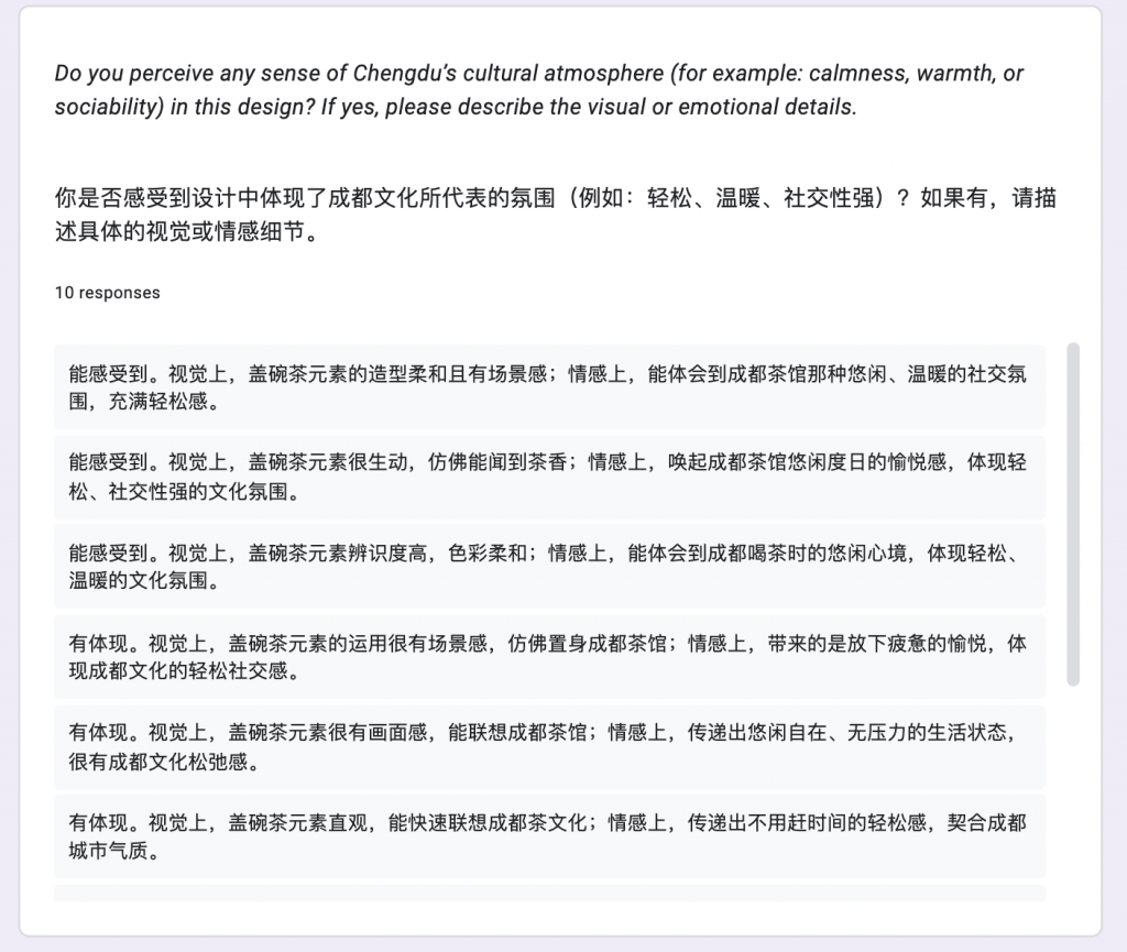
I can feel it. Visually, the gaiwan tea elements have a soft form with a strong sense of scene; emotionally, it conveys the warm, leisurely social atmosphere of Chengdu teahouses.
I can feel it. Visually, the gaiwan tea elements are vivid—as if one could almost smell the tea aroma; emotionally, it evokes the pleasure of spending slow, carefree days in a Chengdu teahouse, reflecting a relaxed, highly social cultural mood.
I can feel it. Visually, the gaiwan tea elements are highly recognizable, with gentle colors; emotionally, it conveys the unhurried mindset of drinking tea in Chengdu, embodying a light and relaxed atmosphere.
It is expressed. Visually, the use of gaiwan tea elements creates a strong sense of scene, as if one were inside a Chengdu teahouse; emotionally, it brings a feeling of dropping one’s fatigue and experiencing joy, reflecting the easygoing and social nature of Chengdu culture.
It is expressed. Visually, the gaiwan tea elements feel vivid and cinematic, easily evoking imagery of Chengdu teahouses; emotionally, they communicate a state of ease, comfort, and pressure-free living, capturing Chengdu’s sense of relaxed culture.
It is expressed. Visually, the gaiwan tea elements are straightforward and immediately bring Chengdu’s tea culture to mind; emotionally, they convey a sense of not needing to rush, aligning well with Chengdu’s relaxed rhythm.
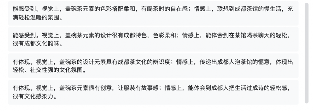
I can feel it. Visually, the color palette of the gaiwan tea elements is soft, evoking the ease of drinking tea; emotionally, it brings to mind the slow-paced life of Chengdu teahouses, filled with warmth and relaxation.
I can feel it. Visually, the gaiwan tea elements are distinctly representative of Chengdu, with gentle colors; emotionally, it conveys the lighthearted feeling of chatting over tea in a teahouse, rich with the charm of Chengdu culture.
It is expressed. Visually, the gaiwan tea design elements have clear recognizability within Chengdu’s tea culture; emotionally, they communicate the pleasure of lingering in a teahouse, reflecting Chengdu’s relaxed and socially vibrant atmosphere.
It is expressed. Visually, the gaiwan tea elements are creative and give the garment a sense of storytelling; emotionally, they capture the effortless, poetic way Chengdu people live their daily lives, carrying strong cultural resonance.
These responses showed that the cultural essence of the sketches had not been lost; on the contrary, it was quite consistently identified.
Yet, the feedback was not without critique. While acknowledging the cultural direction of the sketches, several designers raised thought-provoking questions. For instance, one pointed out, “The sense of visual fragmentation weakens the feeling of no anxiety.” Another noted, “The material narrative is unclear—it’s hard to perceive cultural experience from the chosen materials.” Others mentioned, “The silhouettes feel too tight, creating a sense of pressure that contradicts the idea of ‘no anxiety.’”
These comments made me realize that while the cultural signals were indeed “recognized,” the ways of expressing them still had much room for refinement. One designer’s remark struck me in particular: “The cultural expression feels too singular—it all revolves around tea.” That sentence made me realize that, although in the previous round I had distilled three cultural dimensions from Chengdu’s food culture, the sketches themselves leaned too heavily on tea culture, which ultimately weakened their richness.
The designers’ critiques were not dismissing cultural expression—they were reminding me that culture is not a mere accumulation of symbols, but a state that can be worn, perceived, and experienced. When the mode of expression relies too much on a single symbol, it risks becoming superficial and direct, lacking nuance and depth.
This reflection led me to reconsider how “No-Anxiety Design Thinking” could be represented. Perhaps it doesn’t need to be expressed through specific objects at all; perhaps it can be conveyed through the breathability of a silhouette, the softness of materials, or the warmth of colors—in more abstract yet profoundly expressive ways.
The most important insight I gained from this fourth round of questionnaires is that the industry is not incapable of understanding culture; rather, it is highly sensitive to whether cultural expression feels deep, natural, and emotionally resonant. I came to realize that the real issue was never about “being understood,” but about “being felt.” Cultural expression doesn’t fail because it’s unrecognizable—it fails when it lacks layering and subtlety.
Chinese Version:
在第四轮干预中,我最期待的一部分,是行业设计师如何解读五张来自共创工作坊的草图。我原本以为他们的反馈会呈现很大的个体差异,但当我开始阅读问卷时,我意识到情况比我预想的更清晰甚至可以说,更一致。
不同于我之前担心的“误读”,设计师们几乎都准确地捕捉到了草图中的文化线索。他们提到得最多的词是:茶馆、盖碗茶、茶器物、慢生活、惬意、成都的悠闲感。无论是从视觉轮廓、色彩、器物造型,还是整体情绪,他们都能自然地将草图与“成都的茶文化”连接起来。但是我认为这些问卷均采用中文回复,可以想象设计师们或多或少是对成都文化有了解的人。如果放在更辽阔的位置例如国际上展示,在不了解中国文化的前提下的他们,我认为他们是看不出草图中的文化线索。
让我印象很深的一位设计师写道:“第二张将盖碗茶元素融入,色彩柔和,还传递出喝茶的愉悦心情。” 另一位表示:“这体现的是成都茶馆的生活方式。”甚至有人从草图中读出成都人的生活节奏:“慢悠悠的,很成都。”
这些回应说明草图的文化线索并没有丢失,相反,它们被相当稳定地识别了出来。
然而,这些反馈并不是毫无批判的。在肯定草图文化指向性的同时,设计师也提出了不少值得反思的问题。例如有人指出:“视觉上的割裂感削弱了无焦虑感。”也有人提到:“材质叙事不够清晰,很难从材料看出文化体验。”还有人反馈:“轮廓过紧,会让人感到压迫,与‘无焦虑’矛盾。”
这些意见让我意识到草图的文化表达虽然“被看见”了,但它们在“如何表达”这一点上仍有许多可以完善之处。尤其是有设计师提出:“文化呈现方式有点单一,全部集中在茶上。”这句话让我突然意识到,我在上一轮干预中虽然从饮食文化中提炼出了三个维度,但在草图创作时,文化线索过度依赖茶文化本身,反而弱化了丰富性。
设计师的这些反馈并不是在否定文化性,而是在提醒我文化不是符号的堆叠,而是一种能够被穿着、被感知、被体验的状态。如果表达方式过于依赖单一符号,就容易显得表面、直接,而缺少层次。
这让我重新思考“无焦虑设计思维”的呈现方式。也许,它不一定要通过具体器物来表达;也许,它可以通过廓形的呼吸感、材料的柔软度、色彩的温度,以更抽象但更深层的方式传达出来。
第四轮问卷带给我最重要的发现是行业不是看不懂文化,而是能够非常敏锐地判断文化表达是否深入、是否自然、是否具有情绪与体验的力量。这让我意识到真正的问题从来不是“看不懂”,而是“能否被感到”。文化表达并不输在辨识度,而输在层次与细腻。
Leave a Reply